Wednesday, 24 March 2010

Metaphor and allegory to aid understanding

Accenture is the world’s leading provider of management and technology consulting services and solutions, with more then 70,000 people in 46 countries delivering a wide range of specialised capabilities and solutions to clients across all industries.

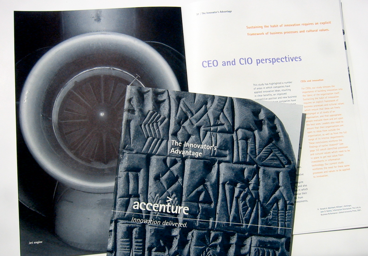
When the name Accenture was launched a visual identity was also adopted to help communicate Accenture’s ‘raw entrepreneurial energy to envision and follow through on far-reaching ideas’. We were commissioned to put the visual identity into practice across a range of marketing collateral.

As well as respecting the corporate guidelines for the Accenture brand, the challenge was to create distinctive designs to differentiate different parts of the business and different types of documents - case studies, executive briefings and white papers as well as leaflets, CD covers and presentation screens. Using metaphor and allegory we gave documents a unique and distinctive feel whilst expressing concepts which included thought leadership, management skill and innovation.


Tuesday, 13 October 2009

Marvelous Mariscal drawing life

Javier Mariscal was born in Valencia, Spain in 1950. He began his diverse career when he moved to Barcelona in the early 1970s during the last years of the Franco dictatorship. Marical worked as an underground comic artist. Later, as Barcelona emerged from its troubled past, Mariscal gave the city a graphic identity, full of optimism reflecting the new Spain. The project culminated in his work for the Olympic Games of 1992 when he created Cobi, the mascot that was to be recognised by millions, as well as an identity and signage programme.

Mariscal now operates a large studio, with clients around the world and is currently working on a full-length animation feature film.

The photographs were taken on a visit to the Design Museum with students from the MA Design for Communication course University of Westminster.


Wednesday, 26 August 2009

Strange and wonderful characters

It usually starts on the plane to Thailand you bump into some
strange characters! here are a few strange and wonderful characters
I met in Bangkok.


Monday, 15 June 2009

In-flight contemporary values


Giving customers more without added costs was the brief from Britannia Airways. To define the brand values of an airline dedicated to fulfilling holidaymakers’ expectations, we worked closely with teams comprising of key internal and external audiences. Everyone from employees and cabin crew, to customers and specialist suppliers. 

After defining the essence of Britannia’s appeal, we created a powerful and intriguing ‘360 degree’ concept which then became the visual shorthand for a strong, lively carrier. The identity visual language is used imaginatively on everything Britannia produces to enhance brand experience with customers.

As part of the airline’s focus on service, we created the OBK sub-brand targeted at ‘On-Board Kids’. Fun and funky OBK is able to meet the demanding needs of some of the most brand-aware customers - young children and teenagers.

At a functional level, alongside the light and contemporary cabin interiors, we also created a refined seat design for new 767-300s to increase the perception of space.


Aer Lingus’s image came under scrutiny during the process of significant change as the airline examined ways of communicating its unique character in a competitive context. We were commissioned to evaluate perceptions of the Aer Lingus brand and to develop a new visual identity.

A more distinctive and energetic identity was designed to reflect the aspirations of the airline, the airline’s key markets are Europe and North America. Driven by the concept of ‘Modern Ireland at its best’, to place emphasis on modern values while reflecting Irish heritage, the identity drew its inspiration from strong associations with the character and natural beauty of Ireland. The visual language draws on Ireland’s rich literary heritage using quotes from famous Irish writers.

A major part of the implementation programme was aircraft interiors for both long and short haul classes of service - with particular attention to how classes are communicated, and physically managed, in the cabin environment. The identity visual language concept was reflected in cabin environment with the quotes theme woven into carpets, seat fabrics and reflected throughout in-flight service material such as luggage labels and ticket wallets.

Monday, 11 May 2009

Dungeness: The lyrics of Athlete ring true


A selection of photographs taken on a day in Dungeness.

Dungeness Lyrics by Athlete

I found a rope and a rubber glove
You found some pretty stones and they had holes so you could tie them together
Tie them together
Tie them together

And when we spoke there was silence
Cos there’s no need to make a sound when you’re got
Smiles instead
Smiles instead
Smiles instead

Go to Dungeness
Let’s go to Dungeness

No tall latte in a rusty shed
Just shots of light and broken bike to stimulate your busy head
In Dungeness
In Dungeness
Try Dungeness